In this image Kate Nash is in touch with her normal surroundings, this was something we tried to echo in our shots of Laura who will be playing Kate Nash in our video. This normal environment which Kate Nash is surrounded by is a typical convention of the indie genre. However the settings in Kate Nash’s videos whilst normal conceptually, are jazzed up using fun elaborate props which are usually brightly coloured. This image of her is also inspiration as to how we may dress Laura during the scenes in the park and outdoors.


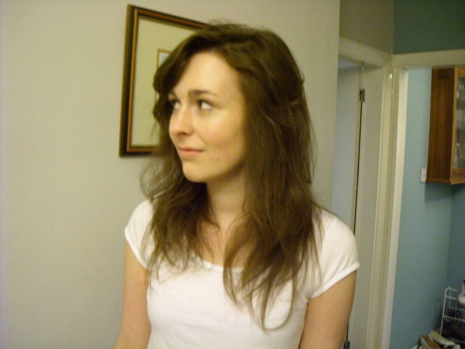
The outfit Laura is dressed in is what we plan to use in some scenes of our music video as the flowery ditsy clots are typical dress used by artists like Kate Nash. Laura's make -up is minimal as is Kate Nash's and other indie artists. We felt this kept to the indie and realistic aspect of the music genre, as the indie genre uses detailed mes-en-scene for the outfits, for example artists often wear converse and t-shirts; therefore we have put a lot of focus onto what Laura wears. Make-up is not usually a main convention in indie music videos therefore we have chosen to keep her make-up minimalistic, this also emphasizes the importance of fashion which is typical of the pop genre. Although make-up will not be a huge focus in our mes-en-scene, we do plan to paint Laura's nails in vibrant colours as this too reflects the style and image of Kate Nash, and we intend to back-comb Laura's hair so it has a bushy effect.
The poses which Laura has been photographed in are casual as this reflects the attitudes of Kate Nash as she is a relaxed artist who conveys the 'easy life' with no cares. Furthermore the environment is common and what we intend to use in our music video - this is also in keeping with the indie theme.



.jpg)
.jpg) The Noisettes relate to our artist Kate Nash particularly through their artistic flare and image. The Noisettes are categorized in the indie/pop/rock music genre, as their music has a soulful and blues tone mixed in with a rock/pop edge. The fashion which is central to the pop genre is a big part of this band’s image, however as the fashion is more of a rock style, they fit into this genre just as well. Therefore the image of the band perfectly matches the band’s music genre. The effect of the mes-en-scene in this digipac is of power this is shown through the close up of the female artist on the cover with the two men appearing much smaller underneath each of her hands.
The Noisettes relate to our artist Kate Nash particularly through their artistic flare and image. The Noisettes are categorized in the indie/pop/rock music genre, as their music has a soulful and blues tone mixed in with a rock/pop edge. The fashion which is central to the pop genre is a big part of this band’s image, however as the fashion is more of a rock style, they fit into this genre just as well. Therefore the image of the band perfectly matches the band’s music genre. The effect of the mes-en-scene in this digipac is of power this is shown through the close up of the female artist on the cover with the two men appearing much smaller underneath each of her hands. 


.jpg)

.jpg)